Figure 1. “Send form” window showing options for direct and embedded links.
|

Figure 2. Form showing “Responses” tab with three test data responses collected.
|

Figure 3. Responses window showing individual data, with green spreadsheet icon and “More options" icon in upper right-hand corner.
|

Figure 4. Data set up for graph functions, with labels in column A and means in column B; means should be piped in from each cell above (e.g., “=B25" to pull the mean from cell B25) or set to calculate the mean from the submitted data (e.g., =Average(B2:B24)).
|
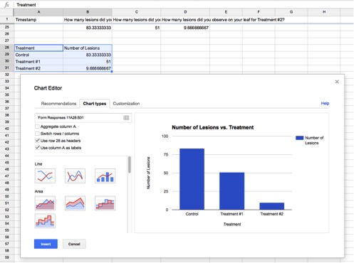 Figure 5. Chart Editor window showing basic chart types and options available. Figure 5. Chart Editor window showing basic chart types and options available.
|
 Figure 6. Chart showing down arow with selection options. Figure 6. Chart showing down arow with selection options.
|

Figure 7. Publish window showing “Interactive" and “Automatically republish" options.
|

Figure 8. Canvas editor window showing introductory text entered and blue “HTML Editor" link.
|

Figure 9. HTML view of editor window showing introductory text followed by pasted embed link.
|
OVERVIEW
There are plenty of tools available to collect student answers and generate instant graphs if the questions are multiple-choice. But, what if you want to collect and graph student-generated data? And, what if your class is online and nonsynchronous? The method presented here will allow you to collect student data and generate customized, self-updating graphs for use in in-person or online applications. Use cases include
- Data collected asynchronously from online assignments, such as computer simulations or individual “experiment-in-a-box" lab activities.
- Data from lab groups during laboratory class meetings, so that you can see how many groups have completed a task, and students can see replicated data from the entire class.
- Data from training exercises with research personnel to show accuracy and variability instantly upon completion of the practice run.
Essentially, this technique allows one to do the work of graphing data up front, before the data are collected, so that the visuals are available for immediate feedback and discussion upon data generation. It uses Google Tools to build real-time data collection and graphing. The students simply enter their data into a form, and the graph changes as each new data point is added. Both the form and the graphs can be embedded into a Canvas page or other application of choice.
A NOTE ON USING GOOGLE DOCS TOOLS IN THE CLASSROOM
Google Docs, as used through an individual profile, do not meet security requirements for protection of student data. If you are using Google Docs tools in your personal Google account, you should not collect any sort of private data, including student names, emails, or ID numbers. If individual submission tracking is needed, students should use an anonymous identifier and submit their identifier to the instructor through a secure channel. However, they will not need to have a Google account to enter data or view results. If your institution has a G Suite/Google Workspace subscription, logging in through your university account will offer appropriate privacy protections, but students will also need to be logged in with their institutional profile in order to participate.
INSTANT GRAPH INSTRUCTIONS
- Log in to Google and go to Google Forms (https://docs.google.com/forms). Use the “Start a new form" link to build your data collection form.
- Edit the question field with your data request question. For example, “How many lesions did you observe on your control leaf?"
- Using the drop-down menu, change the answer type to “short answer."
- Click on the “Show more" icon (three dots) to drop down the additional options menu, and select “Response validation."
- In the resulting drop-down options, select “Number" and “Is number" to restrict your responses to numerical data. You can also use this to further limit input options (e.g., number is greater than or equal to zero). If you like, you can customize the error text that students will see if they try to enter a nonnumerical answer.
- Continue adding questions until you have a question for each data point to be collected. When you are finished, click “SEND" to obtain a link for the survey form (Fig. 1). Click the link icon to copy the form link immediately. Paste it into a safe place for your records. If you want to embed your form in a Canvas page, click the “<>" icon to obtain the embed link and copy it.
-
Enter some test data.
- Paste your survey link into the browser bar in a new tab, and enter some data. This will allow you to test the function and appearance of your graph.
-
Return to your form and click on “Responses" at the top of the form (Fig. 2).
- Click on the green “Link to sheets" icon to create a Google Docs spreadsheet that will be linked from this survey (Fig. 3; you also can select the “More options" icon (three dots) and select “Select response destination" from the menu options). Unless you have already created a spreadsheet for this data in Google Docs, leave the “New spreadsheet" option selected and click “Create." A new spreadsheet will open with your data.
- Because you will want to graph the means, not the individual data, select a row below where you expect your data to end (row number = # of students in class + # of test data entries +2; it is okay to have extra rows) and insert the means formula for each column of data. This is the same formula used in Excel software: =Average(x:y), where x:y is the data range.
- Create your data graph. You can use any graph type; this example will use a simple column graph.
- For the column graph, your data must be in columns on your spreadsheet. To set up your data correctly, choose a new location below your calculated means and enter your treatment names in one column and set each corresponding value in the adjacent column by setting the value as equal to your means cell (Fig. 4).
- Add headers as desired; these will appear by default as the axis titles.
- Select your newly organized summary data (treatment names and means) and click on the “Insert chart" icon
![]() in the toolbox at the top of the spreadsheet.
in the toolbox at the top of the spreadsheet. - In the Chart Editor window (Fig. 5), select the chart type desired.
- Click the “Chart types" tab to customize how the chart tool uses your data (e.g., use column A as labels).
- Click the “Customization" tab to add a chart title, select colors, etc.
- Close the Chart Editor to view your chart on your spreadsheet. Click the small down arrow in the upper right-hand corner of the chart to see the “Chart Options" menu. Select “Publish chart" (Figs. 6–7).
- Make sure that the publish option is set to “Interactive," not “Image."
- Click the drop-down arrow and “Published content & settings" and make sure that the “Automatically republish when changes are made" box is checked.
- Click “Publish."
- Copy the link and paste it in the same safe place where you put the link to your data form. Then click the “Embed" tab and copy and paste that link as well.
- Embed your data entry survey and graph into a Canvas page.
- Go to “Pages" in your Canvas course shell. If a front page has already been created, click “View all" and then “Add a page."
- Give your page a title, and add your desired text to introduce your data form.
- Click on the “HTML Editor" link to switch views (Fig. 8).
- In the HTML view (Fig. 9), move to the next line beyond your introductory text, and paste the embed link for your survey.
- Click the “Rich Content Editor" link to return to rich content view. You should see a large gray box. Drag the corners to size the box as you like.
- Click “Save" to view the results. You should now have your data survey embedded into your Canvas page.
- Embed your results graph into the Canvas page.
- Using the steps above, you can set up your results graph in the same page as the data survey or you can create a separate page for the graph, depending on how and when you wish to present the graph to your students. If you place the graph below the survey, they can see the graph, add their data, and see how the graph changes. If you don't want students to see the graph before entering their data, you can place the graph on its own page and control access to the results page. Note, it may take several seconds for the graph to update, and students may need to click the “Reload" button in their browser to force the browser to recheck for the updated graph.
APPLICATION NOTES
Instant graphing of student data supports real-time discussions of variability in data and the importance of replication and also allows you to catch and troubleshoot outliers while your students are still in the room. For online applications, the update-as-you-go function allows students to interact asynchronously and see the impacts of their own data as it is added to the class set. If desired, you can even parse the data to graph different segments, so that students can see the means tighten with increasing replicates (e.g., graph rows 1–5, 1–20, and 1–50 on three separate graphs for comparison). Google tools also allow interactive links to tables, so statistical analyses can be set up in advance using these same methods, with the results pulled into a self-updating table.